User Research, User-Centered Design, UI Design
Self Tracking
Project Overview
This is a 10-week class project on human centered research. This class exposed students to all types of research techniques that allow us to gather data, extract user insights, ideate solutions, and finally build a product based on user needs. In a team of 3, we picked the topic self tracking and went through the entire process of user-centered research. We created a product based on user research and presented high-fidelity prototypes at the end.
What is self tracking?
Self tracking is a modern technology of collecting data about yourself and your surroundings to gain self knowledge with a goal to optimize yourself. Whether tracking your daily steps on your smartphone, or monitoring your heart rate with an apple watch, or discovering your sleep pattern are all examples of self tracking. With the ever rising trend of wearable technologies, we wanted to explore what’s in it? Why do people use it? What does a user really need? and how do we build a better experience?
Deliverables
Primary research, secondary research, affinitization, ideation, wireframes, and high-fidelity mockup.
Time frame: 10 weeks
Team Members: Fang Di, Mukund Sanjeev, Emily Pan
Year: 2017
Before diving in to the project, I want to share a video of our journey.
01
Secondary Research
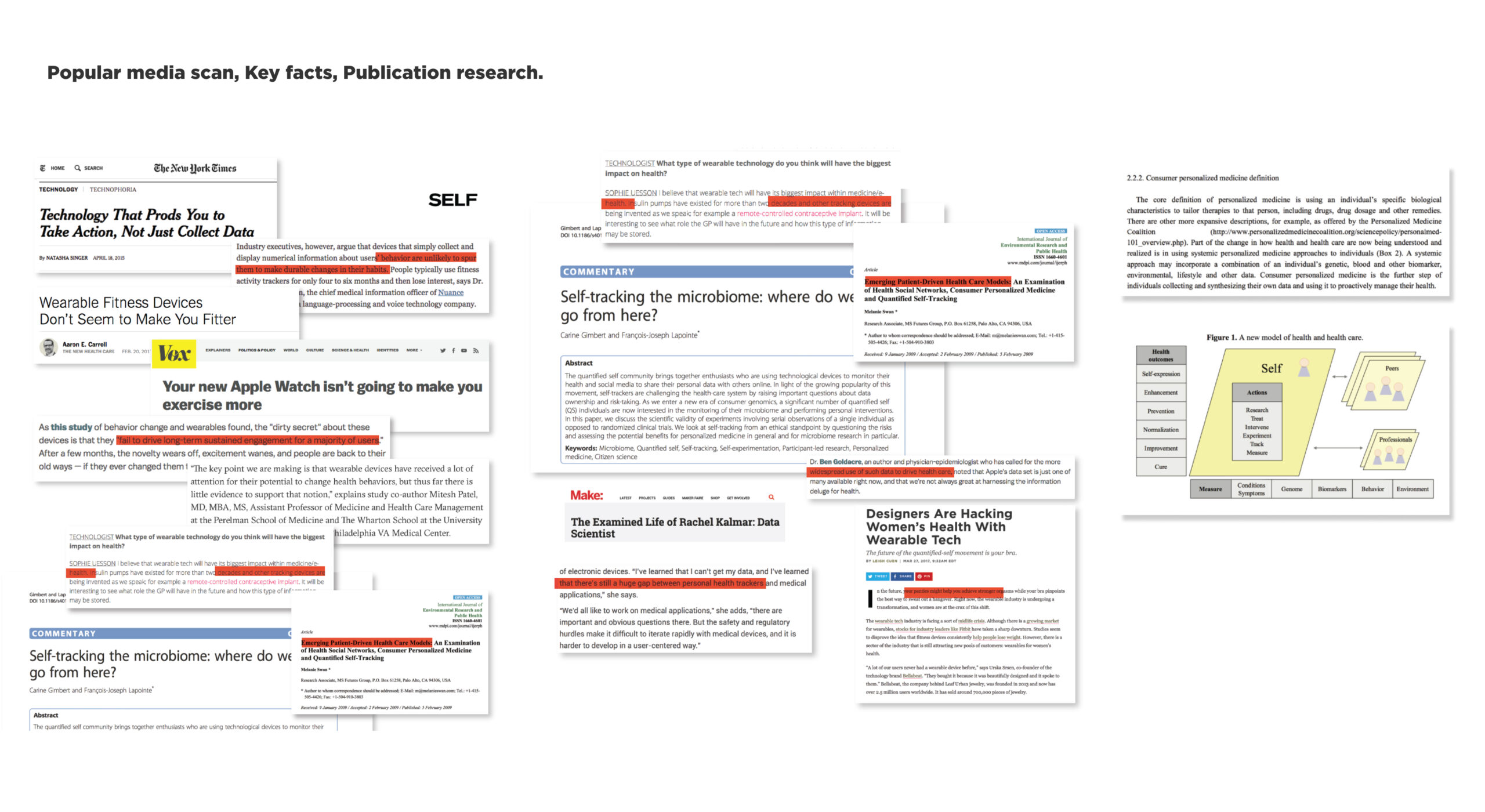
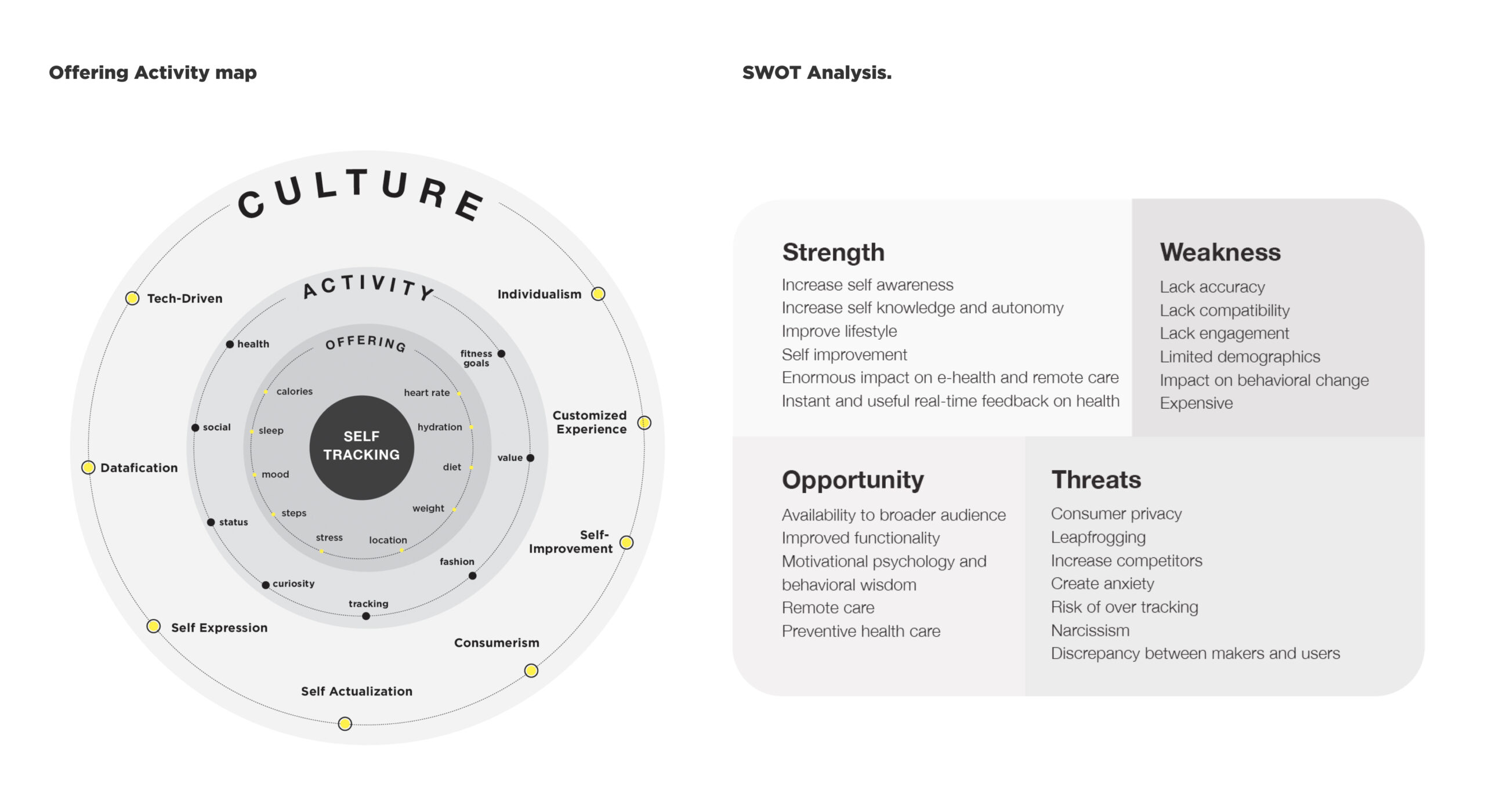
Starting with secondary research, we read publications, online articles, blogs, and books about self-tracking to get key facts and industry trends to gain an overall knowledge of what self-tracking is, what are the current market players, and emerging trends. We used techniques such as Culture-Activity Map and SWOT analysis to gain a high-level view of the industry. The 5 key insights we gained from the research are:
Wearable technology doesn't spur behavior change, and it fails to drive a long-term engagement for users.
Self tracking is going to have the biggest impact on health care, leading to a patient-driven health care.
People experience problems and anxiety from wearable technology, due to a compatibility issue and accuracy.
The current devices and applications are more adapted by the younger generation.
Industry is moving toward smart jewelry and smart textile, specifically towards women's health.
02
Primary Research
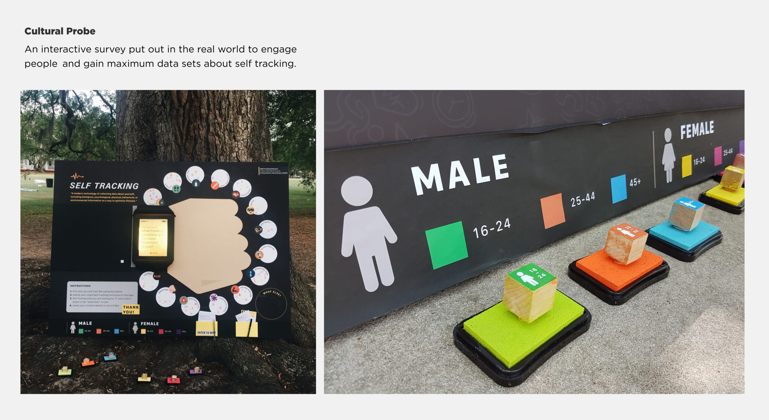
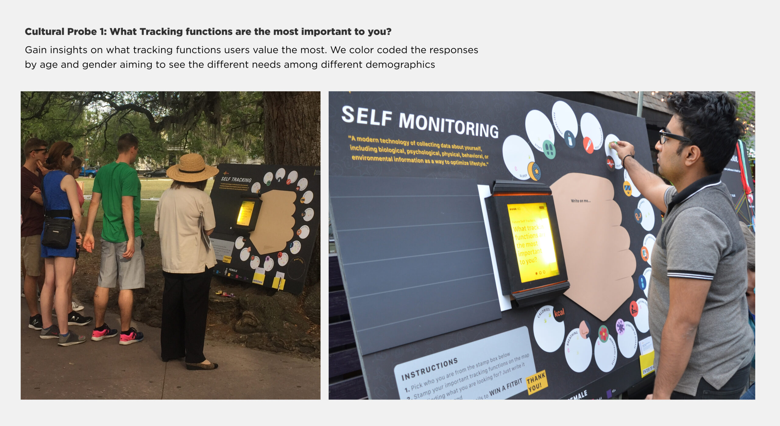
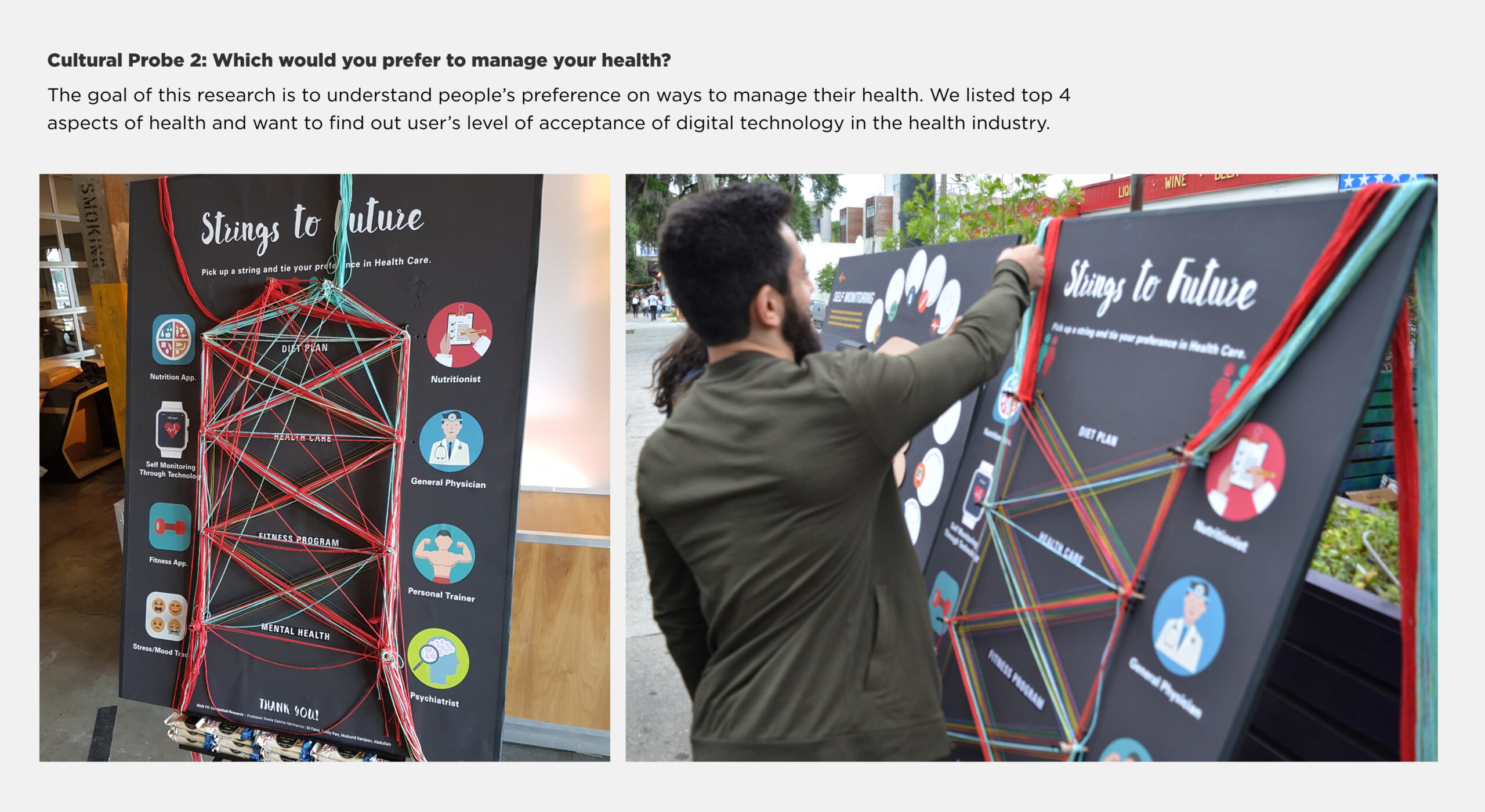
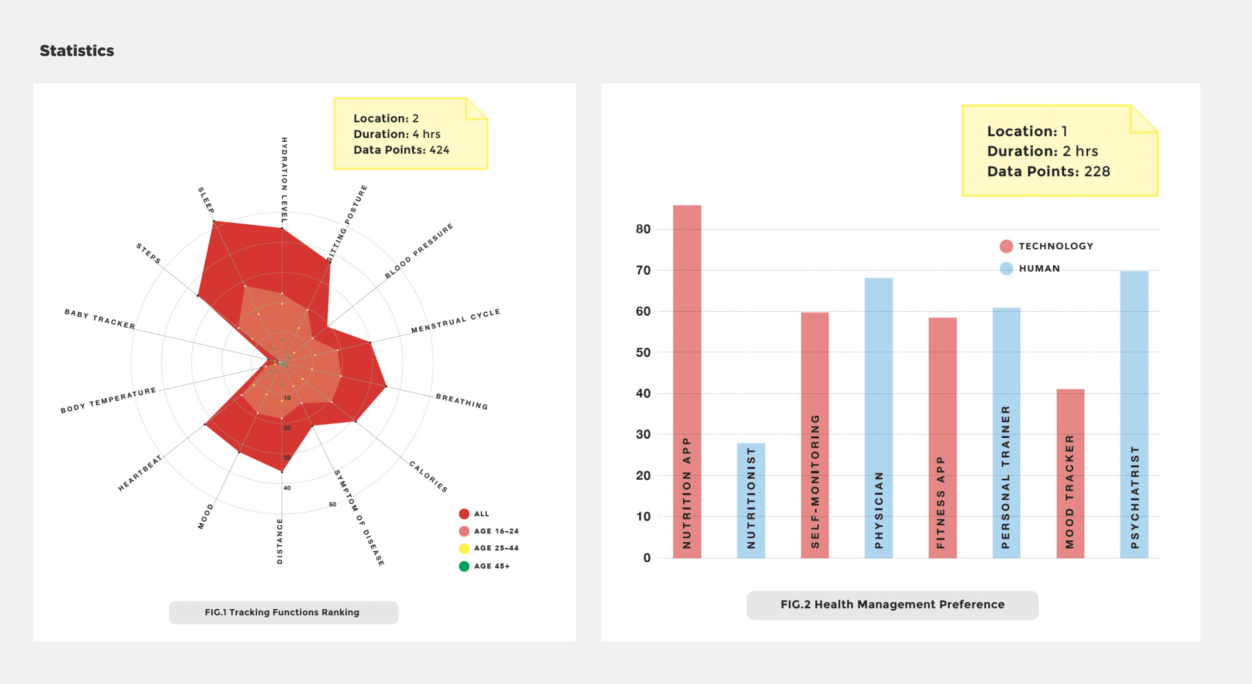
The second phase is to gather maximum data points to help us figure out what things our stakeholders want to track in their life. In other words, which function does a user wants in a tracking device. We also want to understand people's preferences on ways to manage their health. We used contextual research methods, including observations, ethnographic research, in-depth interviews, cultural probing techniques to gather over 300 data points in this phase.
03
Affinitization
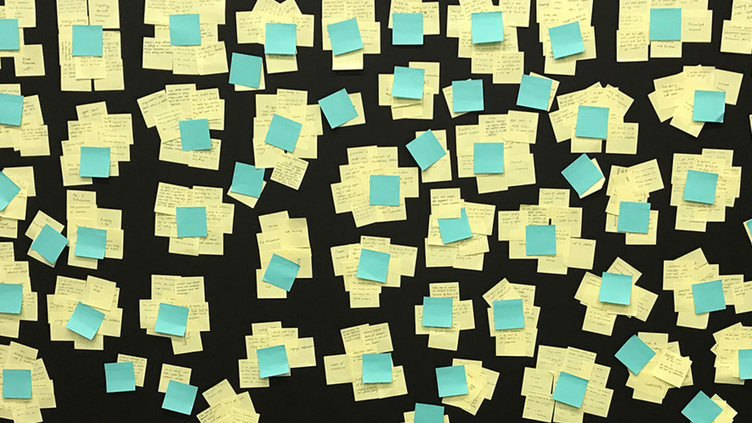
A rapid process of sorting data points to form groups by instantly looking into relationships between data points without pre-assumed categories. Writing in the voice of the users, we frame each group of sticky notes with one-sentence insight that summarize user needs.

User Needs
"I look forward to use and benefit from technology as the young ones do, with the ability to track important health metrics in a way that i can easily adapt."
"I would love to be constantly reminded to sit upright and stay hydrated during work hours."
"Being able to stay connected with my loved ones is very important to me, especially knowing their most recent health status and measurements."
"I believe that the future of self tracking lies in smart clothing that can actively track breathing, hydration level, glucose level, and have the ability to detect health risks."
User Pain Points
"I always forget to charge my wearables so that I don't wear it consistently."
"My mom lives alone and has chronic disease. I want to make sure that she's taken good care of herself and stays healthy."
"I forgot to drink water during the day when the work gets very busy."
04
Ideation
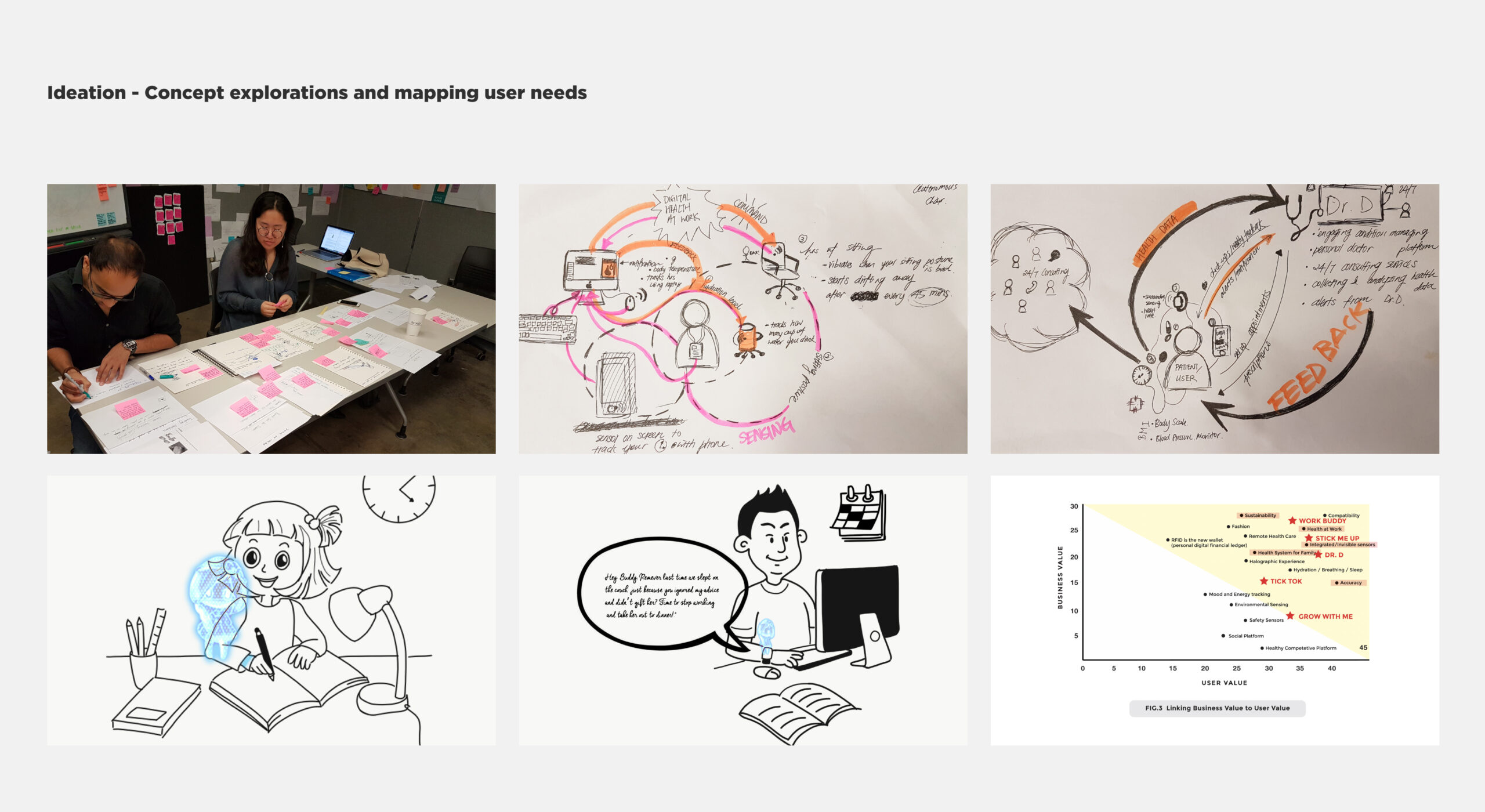
The final phase is to explore ideas based on the user needs and pain points we identified from the research. We went through various ideation methods such as concept sketch, concept sorting, solution storyboard, and concept-linking map to filter down our solutions.
Through concept linking exercise, we find the top 3 ideas are Work Buddy (Health at Work), Dr. D (Integrated health system for family), and Stick me (Invisible sensors). We merged these two 3 ideas into our two final design solutions.
Design Solution #1
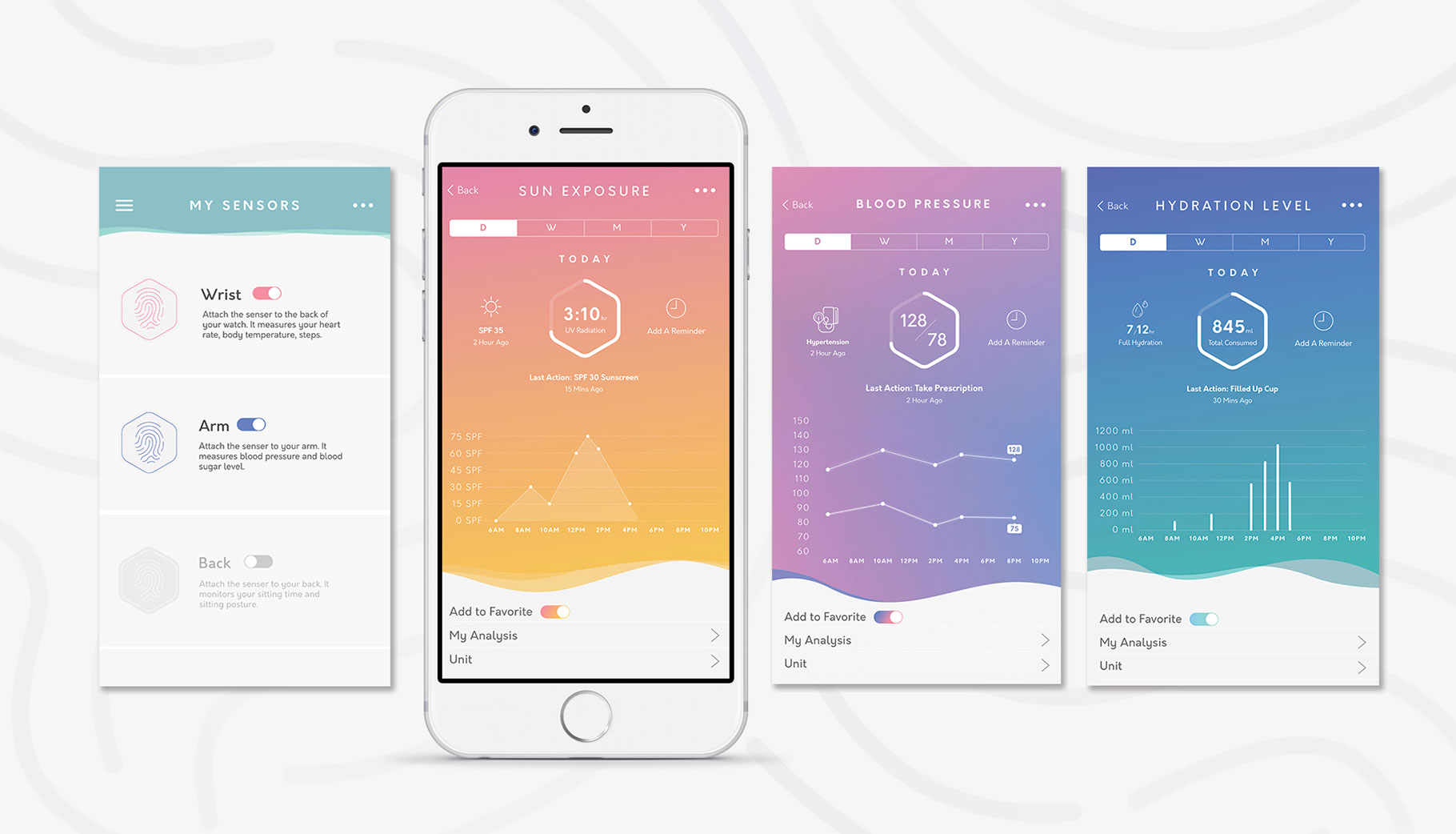
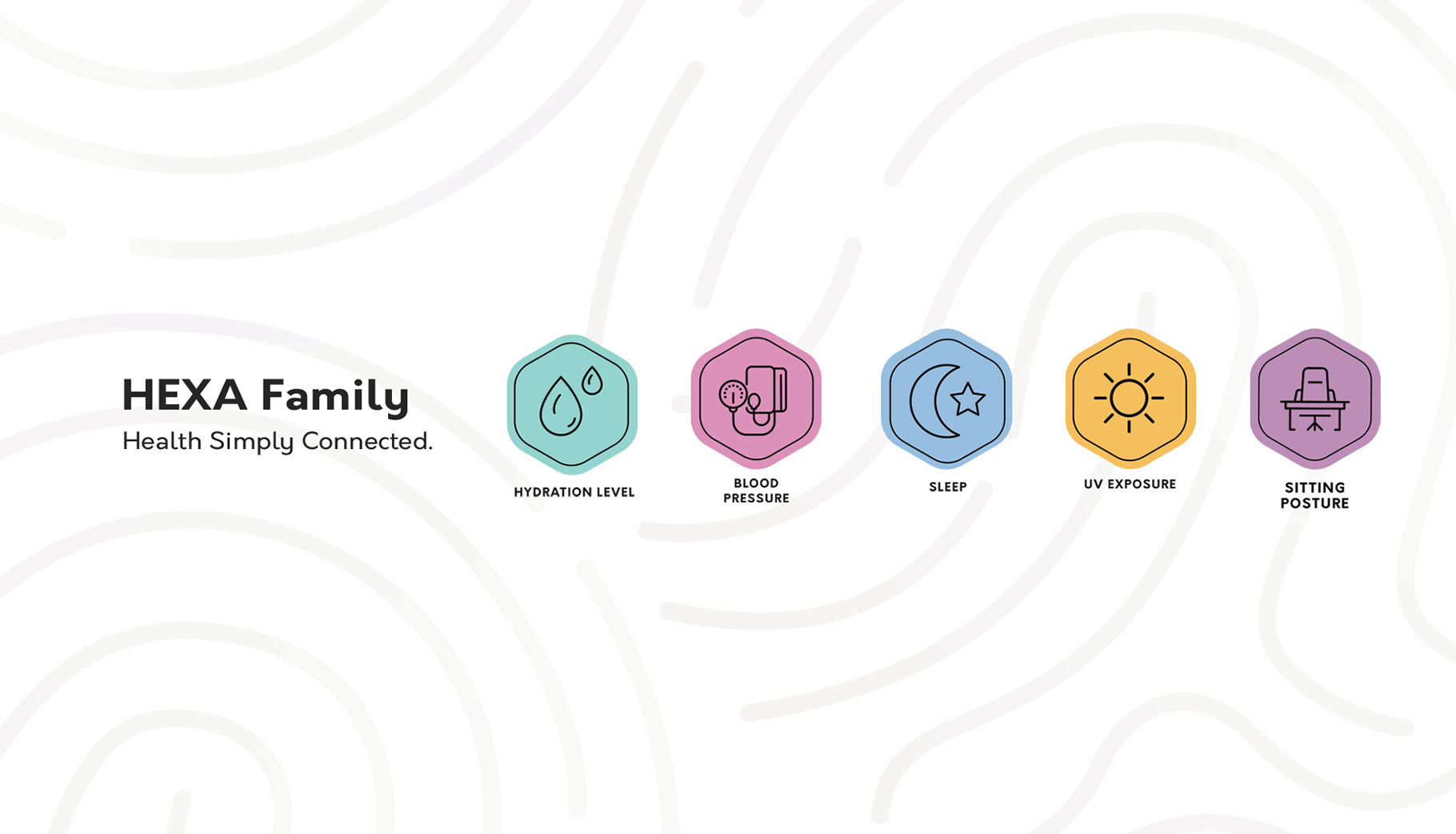
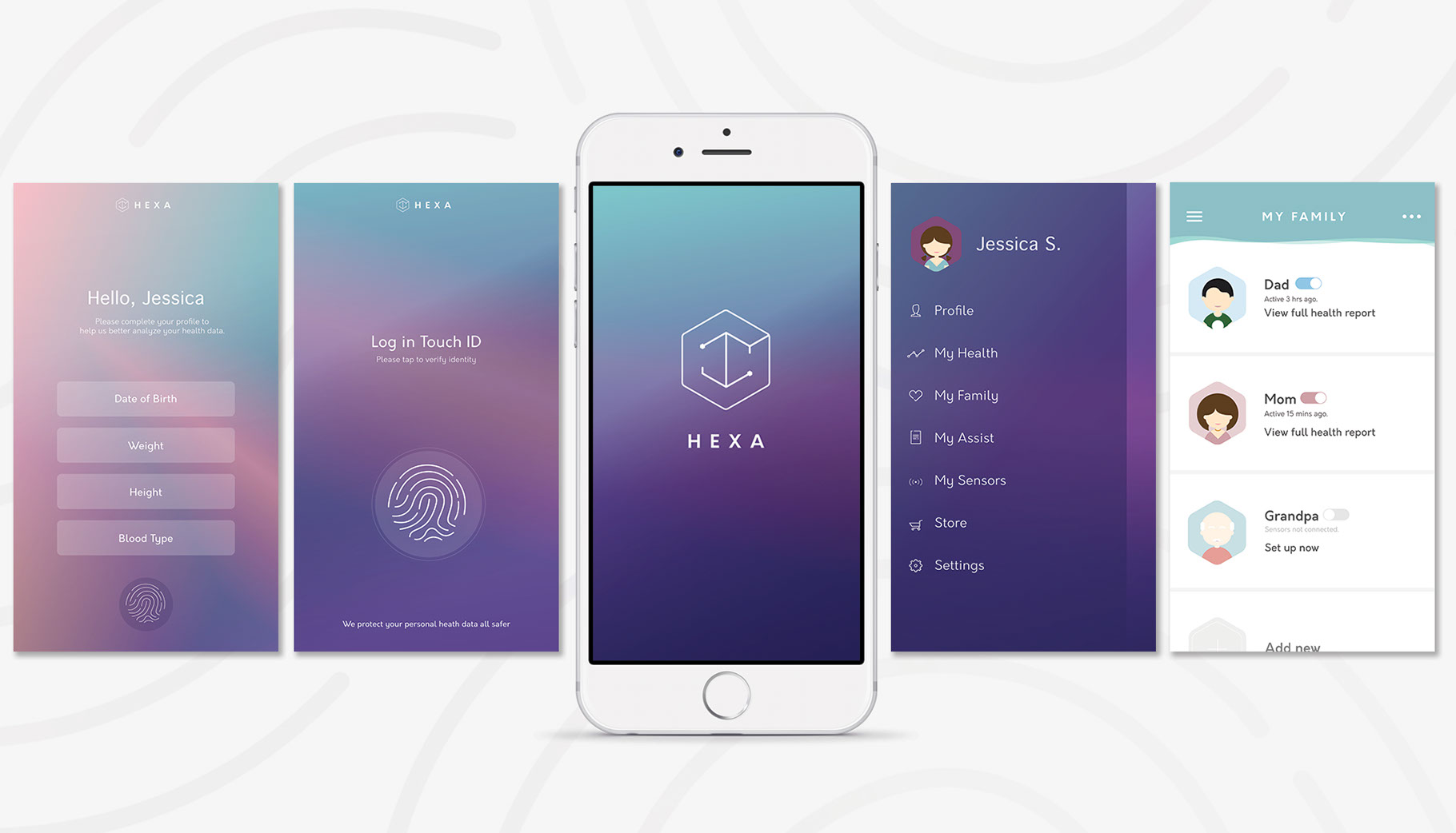
HEXA family, an integrated tracking system that provides you and your family a seamless and engaging platform to track and manage health data on your finger tips. Supported by the latest measuring technology, HEXA sensors are designed to work seamlessly with your gears. From sensing hydration level to monitoring sitting posture, HEXA sensors provide you a 360˚ tracking experience that is customizable and seamless. Simply by attaching sensors to your watch, chair, cup, arm, or back, you can monitor every aspect of your health, from your heart rate to glucose level, blood pressure to UV radiation, sitting posture to sleeping quality.
Design Solution #2
HEXA Work is a digital health system at work to keep employees healthy and fit. Our goal is to help users to be aware of health at work. We designed an integrated system of sensors to keep track of hydration level, physical movement, sitting time, and sitting posture at work. We aim to cultivate a work environment that adopts health as an essential part of the company culture. Hexa Work helps employees to stay healthy and feel good, because we know this is the foundation of everything.
What I would’ve done differently….
To some degree I wish I took this class or completed this project after my UX internship with Digitas. I did not have the professional UX/UI knowledge to design the product. I would at least draw out a few key user flows, for example a sign up flow, a set up flow for sensors, and a notification flow. I would also change the look and feel of the app interface. There wasn’t too much conceptual thinking in terms of visual style due to the time restraints. But process wise, I definitely think it’s one of the most comprehensive projects in terms of the amount of user-centered research we did and the methodologies that we used to design the product.
Other Works

Verizon Pricing RefreshUX Design, Agency work
Goldman SachsUX Design, Agency work
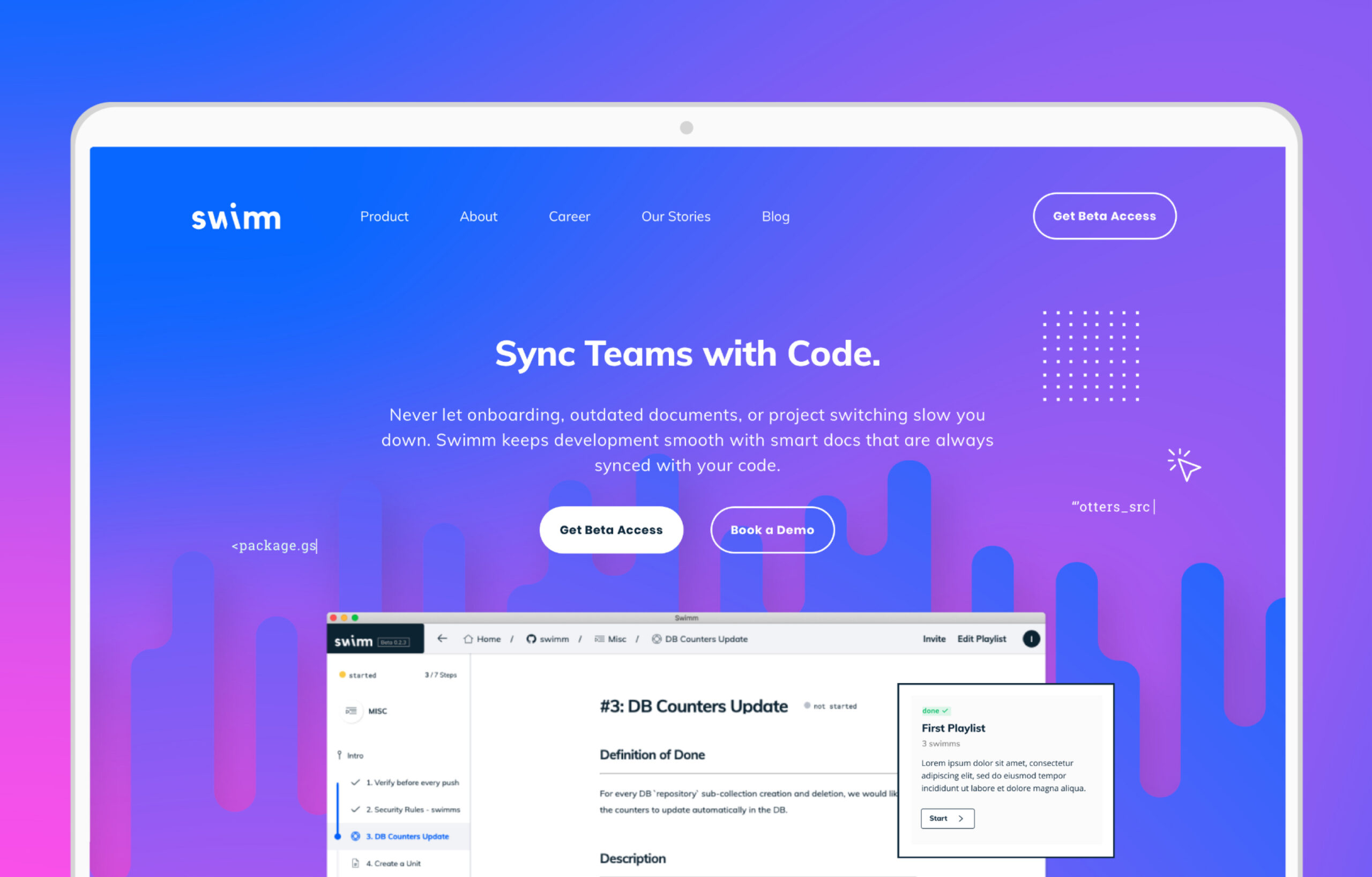
SwimmUX Design, Visual Design
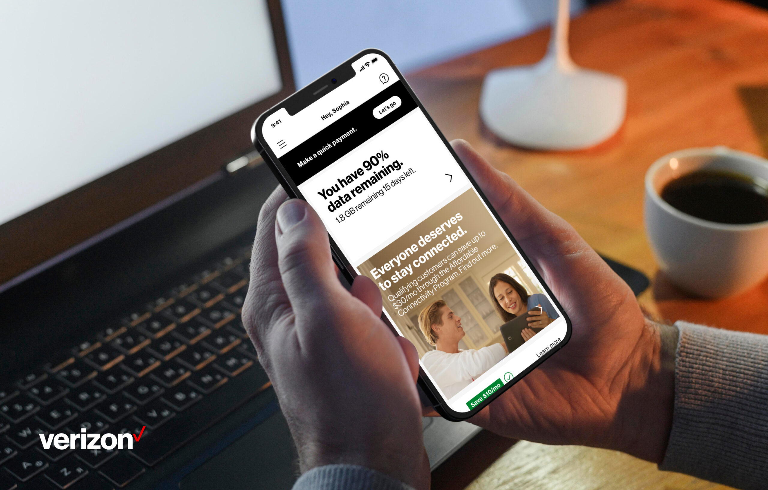
Affordable Connectivity ProgramUX Design, Agency work
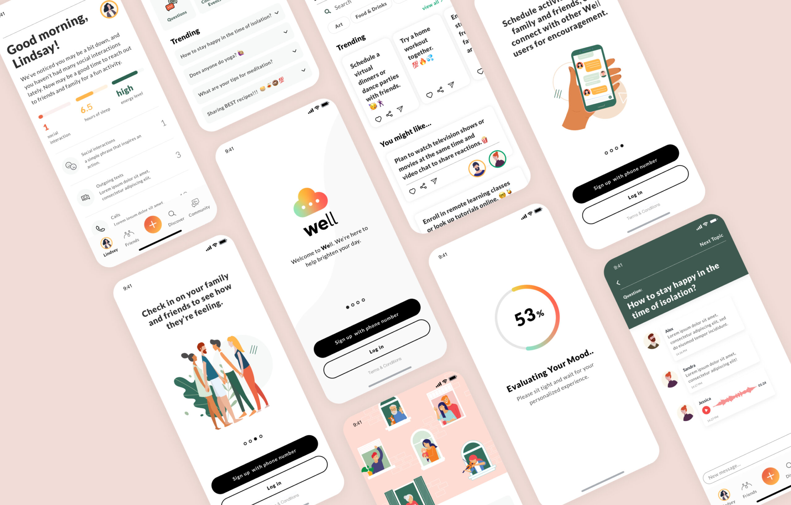
Well Mobile AppUX Design, Passion project
Logo AnimationMotion Design
ItalkBB TVMotion Design, Visual Design
Do not hesitate to contact me to discuss a possible project or just to learn more about my work.
Contact
empandesign@gmail.com
713-261-5605
Social